This is the master bedroom which is located in the new addition. The bedhead, including the shelving and cupboards on either side weren't part of the original plans, but were designed for the clients after the room was built. I love the bespoke joinery in this house (and there is a lot of it) - it really ties in nicely with the original dwelling.
There is plenty of built-in storage here. These drawers and hanging space make up the WIR in the master bedroom.
 |
| Solid casement windows in the WIR provides natural light while providing privacy |
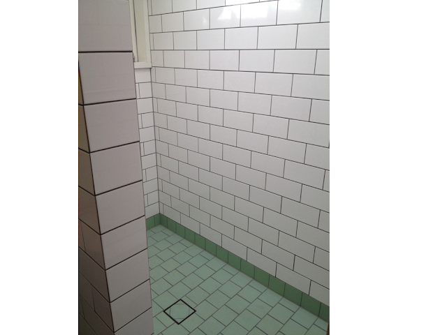
The shower spaces are flooded with natural light, and include both windows and skylights. As you can see they are tiled to the ceiling with white subway tiles.
The floors are tiled with unglazed porcelain tiles in this lovely pistachio green.
 |
| Basin in the ensuite |
Owen and Vokes' are renowned for their simple B&W colour scheme, but the clients here made sure there was plenty of opportunity for some fun pops of colour. The main bathroom is finished with black bevelled-edge subway tiles on the walls and pink floor tiles.
This set of stairs leads down into a utility room at the rear of the house. The placement of windows and light wells have been really well thought out in this house. You can see the timber wall on the RHS has small gaps between each board which allows shafts of light to appear into the staircase (which would look amazing at night.) A similar wall features between the main central hallway and the living room in the original part of the house.
Here's a look down the hallway from the front door. On the left are a couple of bedrooms, and the living room is on the right hand side - behind the new wall. Haven't the old floors polished up well? (All the floors in the new addition are made from blackbutt, which is what we have selected too.) In the distance you can see the floorboards, in what was once part of the sleep out, painted green.
Here are a couple of shots of the living room wall (which is the other side of the wall in the hallway above.) The original vj wall had been knocked out by the previous owners, but rather than build it back in with vjs again, the architects used wide horizontal boards leaving gaps in between, allowing light to filter into the rooms. The picture rails were also designed by the architects.
They created small openings just above the picture rails which give you framed glimpses of the intricate patterns of the breezeways above the bedroom doors in the hallway.
Hopefully I'll get some photos of the kitchen and other rooms once they are done. This house has got such a nice and relaxed feel about it - something that a good architect knows how to achieve.


Wowza! Love the tour. The slatted wall is pretty cool. But those bathrooms! Consider me inspired. xx
ReplyDeleteI love those bathrooms! The tiles are wonderful!
ReplyDeleteWhat a cool house. So many interesting little features. Love the pink/green floor tiles, the picture windows and the peekaboo wall cutouts up high. Those O&V guys must have seen Betsy- she has one of those cutouts to let the morning sun into our bedroom, the only problem is the lounge room on the other side! melx
ReplyDelete